
Start with the story, not the specifications
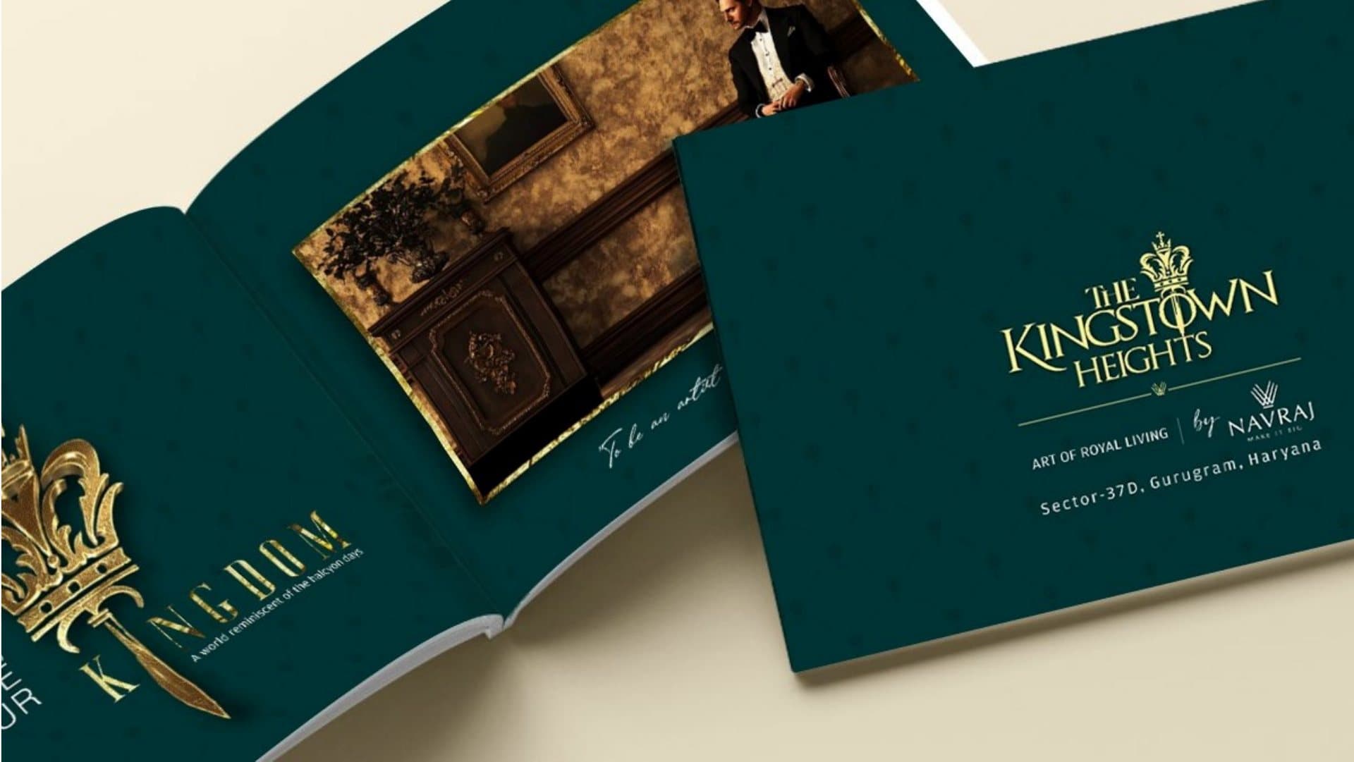
The first spreads decide whether a buyer keeps reading. Open with the one idea the project stands for, shown in a strong image and a short line. The Kingstown Heights brochure, for example, opens on deep green and gold with a crown, so the idea of a royal address lands before any numbers do.
What pages does a project brochure need?
Most project brochures follow a sequence like this:
- Cover and opening spread: the project name, mark and core idea
- Location: the address, a clear map and travel times to key places
- The project: the master plan, towers or blocks, and the overall feel
- Homes or units: floor plans with sizes, clearly labelled
- Amenities: clubhouse, open spaces, security and services
- Specifications: flooring, fittings, structure and finishes
- The developer: credentials and delivered projects
- Next steps: site office address, phone, website and RERA details
Which details must be accurate?
Sizes, plans, specifications and approvals are facts a buyer may rely on. Use the approved figures only, label artist's impressions as such, and include the RERA registration number and website where the rules require it. Leave room in the layout for disclaimers from the start, so they never have to be squeezed in at the end.
How should the brochure look?
Like the rest of the launch. The brochure, hoardings, press ads and site barricading should share the same mark, colours and type, so a buyer who has seen the hoarding recognises the brochure at once. Paper, size and finish matter too: a heavier stock or a special finish on the cover tells buyers the project is worth their attention.
Print, digital or both?
Usually both. The printed brochure works at the site office and at events. A lighter digital version works on phones and in messages from channel partners. Plan both together so the content is written once and adapted, not rewritten twice.